...knows no bounds, and the road to hell is paved and smooth.
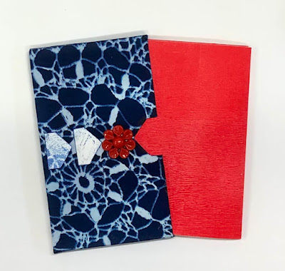
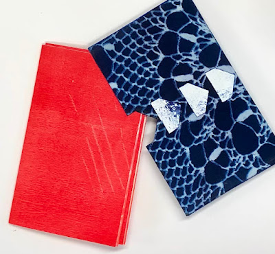
I fully intended to finish off the small cyanotype case this week, insert the book I made it for, and call it done. However, I was less than enamored with the quality of the paper in the little notebook, and changed my other mind. That means, of course, that I've started on yet another book to fit the case, and have two pieces on the go now.
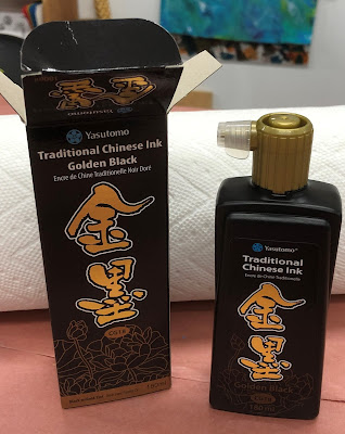
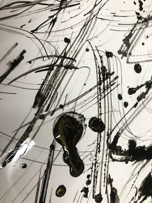
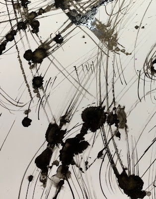
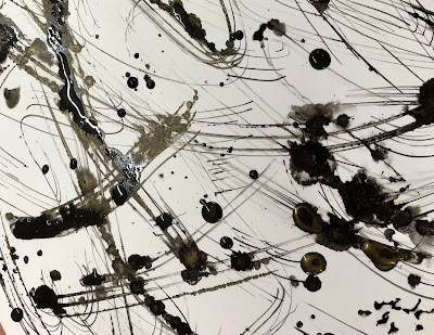
This ink has gold flakes in it, and depending on the paper, leaves a hint of gold as it travels. How could I resist? A recent exploration with alcohol inks reminded me that I'd purchased some Yupo paper, and that seemed the perfect thing to try this on. I scribbled, splashed and dropped the ink onto the Yupo, and really enjoyed the results, especially when I spritzed some 99% alcohol into the mix.
Whether wet or dry, these are some pretty interesting results, I'd say.
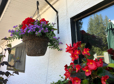
Of course, you know I'm always looking for good colour combinations, and I saw this basket at Black Salt Café in Crawford Bay this past week. It had me drooling even before the fabulous lunch arrived. If you're up in that area, I'd highly recommend both the food and the ambiance!
Here's to summer in our area - we're delighting the in the warm weather and heavenly floral displays!

Oh, being distracted is perfectly understandable - who could resist that ink?! And now you have some fabulous papers to make into a new book which will need its own slipcase...
ReplyDeleteAnd on and on it goes, Tracy, and we creatives are most thankful for that. Because who couldn't use yet another hand-crafted book with it's own slipcase, right? 😆
DeleteDear friend, it's pretty good to choose the alternative you prefer, even if it means having two projects instead of one.
ReplyDeleteThe one of the two that you photographed is downright superb!
And then you played Jackson Pollock with precious ink and we can only encourage you wholeheartedly!
These flowers are indeed superb and I love the deep reds and the purples not pulling too much towards blue (at one time I dressed with these two colours together :).
In my corner of the world, our climate has been rotten since the first day of summer. We went from +16 degrees Celsius above seasonal standards to -5 degrees below. We bring in and take out jackets, sweaters and even duvets. Pffff...
I wish you a good time, whether outside or inside, and I send you lots of kisses.
I believe that one can never have too many projects on hand, and the muse constantly tricks me into more. :D
DeleteI'm with you on the red and purple combo...just luscious!!
Your summer sounds like the way our spring went (and goodness knows your spring was none too great either). I hope it improves substantially in the next couple of days; we were amused/horrified at the need to wear winter jackets in the middle of June here. Now we're into seasonal floods (although not in our part of British Columbia yet) and headed into the hot season which so often leads to fire season. Our planet keeps telling us to stop the pollution, and we are not heeding her warnings fast enough.
Here's to a warming summer for you, and soon! Huge hugs, Win
Hee! Hee! this always happens to me. i start one project and something else sparks up and before you know it there's a whole list of projects and if you don't start them straight away....anyway you know what I mean. Loving the journal case it looks amazing. Have a lovely creative weekend. Hugs, Angela xxx
ReplyDeleteThe best part of all this is knowing we're not alone in our craziness, Angela! It's a comfort to me that mixed media artists (and others) around the world are just as distracted and have just as many unfinished projects on the go. There may not be any hope for us, but there is always a feeling of warmth to know we're not alone! 😉
ReplyDeleteCyanotype. How did adding the fabric to paper work out? The gold flecked ink sounds like a lot of fun.
ReplyDeleteThe fabric to paper (glue sprayed) worked well, although it did require a seal of acrylic liquid medium on each edge to prevent fraying - good to know for the next time, right?! And the gold in the black, while subtle, is really lovely!
DeleteIt's just so satisfying, isn't it Corrie? What fun!
ReplyDelete